DESIGN PRINCIPLES - FINAL PROJECT: VISUAL ANALYSIS
Design Principles / Bachelor of Design (Hons) in Creative Media
Instructions
LECTURES
Lectures
We practice visual analysis to help us understand the artist's intentions in the work that
Phase I:Observation
Identify the observational elements of the design describe them in your own words
Phase 2: Analysis
Think about your observations and make a statement about the work based on the evidence you observed, what a certain element it represents.
Stage 3:Interpretation
What is the meaning of the design? What is the purpose of creating it? Observation and factual analysis of the design work
I chose the goal 10:
- Reduce Inequality

VISUAL ANALYSIS

Observation
Analysis
The man driving the car throws away the food in his hand with a disdainful face, while the poor man next to him is extra eager to eat the food thrown away by the rich man. The social inequality is greatly satirized. This emphasizes the inequality of society and the inequality of resources.
The author uses bright colors to highlight the vitality of the rich and gray to highlight the misery of the poor. The artist uses color to emphasize the contrast between the two.
On the other side, the visual center is the rich man in a red sports car, who is throwing only a bite of food in his hand with a disdainful look. On the other side, the visual center is the old man with his face showing his desire for food. The stark contrast between the rich man's disdain for food, which is the poor man's treasure, is successfully expressed as the main focus of the artwork.
The composition of the main figure zooming in on both sides at the same time forms the balance of the whole painting.
The contrasting backgrounds of the two highlight the inequality and subject matter of the artwork, an effect that stimulates the viewer's interest and helps them learn more about the unfolding story between the two sides.
Interpretation
The author zooms in on the visual center of the two characters, and from the way they dress and behave, fully expresses the economic disparity between the two, the different treatment they enjoy, the different environment, and the fact that the rich enjoy better and have more resources than the poor. It satirizes the inequality of the society.
2. Visual Reference
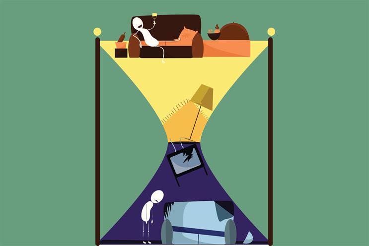
This picture expresses the different social status of the poor and the rich, the different economic differences and the different food treatment they enjoy.

After this work, the most intuitive feeling is that the gap between the rich and the poor is too big. The rich are superior, while the poor can only live at the bottom of the society. It is also a very regrettable thing to live without enough food. . Through this work, the author also hopes to solve the gap between the rich and the poor.

SKETCHES


Fig.1.7 Sketchs
I started coloring and made some adjustments to the image. I put green as the background, green represents equal life,
I changed the car of a person, a man and a woman in the car, because the universal value that the rich will get everything with money. Especially women, at the same time, I also want to express that the rich man would rather take the money to support a woman than to see the poor people underneath and two people can express that they are a group of rich people.
I want to express in this equality but have unequal treatment, express the dissatisfaction of society unfair, economic disparity.

I compared two colors of poor and rich, one lighter and one darker.
The poor carry the rich behind their backs, representing the economic disparity in which the poor are oppressed by the rich. The poor can only cry while looking at the food in the hands of the rich, and then compare the clothes of the two. The rich are glamorous but the poor’s clothes are tattered, which expresses the inequality of resources and economic inequality between the two.
I chose the goal 10:
- Reduce Inequality
Reference Chart

SKETCHES

A man stepping on a group of people standing in the distance looking at the scenery, tasting wine, trying to express the inequality of society, I will zoom in on the man and the small man in the lower right corner to form a stark contrast, and better express the different treatment between the two.

In 13 weeks I got feedback that I changed the group of people stepping on the bottom of the foot to one person, because a group of people can't see what they represent, and one person is better able to reflect the outer appearance of the poor
Final Design

feedback
11 weeks
I misunderstood my analysis and need to rewrite it again
12 weeks
Draw more poor people on the background to show pain, why change a man to a man and a woman need to write down the idea
Week 13
It would be better to change the group of people stepping underneath to one person because it is not clear what the group of people are that are stepping underneath
Week 14
After getting feedback, I revised it. The teacher said much better, but I did not write out my design principles


Comments
Post a Comment