Typography 1 /Exercises

 4.4.2023 - /Week 1-week5
NIE WEIQIU / 0360239 / Bachelor of Design (Honours) in Creative Media
Typography
Task 1 (Exercises)

LECTURES

Week 1 / Introduction & Briefing

In the first week

Mr Vinod asked us to join the typography module group on face book so that we could get information about the files and announcements on face book, and asked us to download ten fonts from My Times as we would be using them throughout the semester, Mr Vinod also explained the module information booklet clearly to us, guided us in class to create a blog Mr Vinod also explained the module information booklet clearly, instructed us to create a blog in class, kept track of our progress, and finally we started our first task of choosing words.

Font: The individual font or weight within the typeface.


Typeface: The entire family of fonts/weights that share similar characteristics/styles.


Mr. Vinod said that there are many different interpretations of typographic terms and that during the semester we will learn about type creation.

Typography: Development and Timeline

1. Early letterform development: Phoenician to Roman
                                                             Fig. 1.1 Evolution from Phoenician letter


                                                Fig. 1.2 Phoenician to Roman
Writing directions
Phoenicians: Right to left 
 Greeks: Boustrophedon (Right to left, left to right) 
 *As they change the direction of reading, they changed the orientations of letterforms


                                          Fig. 1.3 Direction of writing for the Greeks, ‘boustrophedon          

                                        
                                      Fig. 1.4 Greek fragment, stone engraving. (Date unknown)

Hand Script from 3rd - 10th Century C.E.

Square Capitals 

Written version that can be found in Roman monuments

Letterforms have serifs added to the finish of the main strokes   


                        Fig. 1.5 Late 3rd – mid 4th century: Rustic capitals

Rustic Capitals 
Compressed version of square capitals 


                                                           Fig. 1.6 4th – 5th century: Uncials

Uncials
Incorporated some aspects of the Roman cursive hand. Uncials – small letters. The broad forms of uncials are more readable at small sizes than rustic capitals. 


                                                              Fig. 1.7 4th century: Roman cursive

Roman cursive
Written for everyday transactions, forms were simplified for speed. Roman cursive is the beginning of lowercase letterforms. 


                                                                 Fig. 1.8 C. 500: Half-uncials
Half-uncials 
formal beginning of lowercase letterforms


                                                 Fig. 1.9 C. 925: Caloline minuscule
Charlemagne 

The first unifier of Europe since the Romans, issued an edict in 789 to standardize all ecclesiastical texts. He entrusted this task to Alcuin of York, Abbot of St Martin of Tours. The monks rewrote the texts using both majuscules (uppercase), miniscule, capitalization and punctuation which set the standard for calligraphy for a century.


                                                            Fig. 1.10 C. 1300: Blackletter (Textura)

Blackletter to Gutenberg’s type
Textura: a condensed strongly vertical letterform (Northern Europe). Rotunda: a rounder and more open-handed letterform (Southern Europe).Gutenberg's style includes skills of engineering, metalsmithing, chemistry

3. Text type classification 

                                                               Fig. 1.11 Text type classifications


WEEK 2 - LECTURE 2

Typography: Text

1. Kerning and Letterspacing


                                                       Fig. 2.1 Kerning and letterspacing
 

Kerning: Automatic adjustment of space between letters.

Tracking: The addition and removal of space in a word or sentence.

Letterspacing: To add space between letters

Text Formatting 

Flush Lef
- each line starts from same point but ends wherever the last word ends // ragged right 

                                                                   Fig.2.2 Flush left

Centered
 imposed symmetry upon the text 


                                                                    Fig.2.3 Centered

Flush Right
emphasise on the end of a line and opposed its start 
                                                                 Fig.2.4 Flush right


Justified 
 imposes a symmetrical shape on the text

                                                                   Fig.2.5 Justified
 Texture 

 Type with a relatively generous x-height or relatively heavy stroke width produces a darker mass on
 the page than type with a relatively smaller x-height or lighter stroke. Sensitivity to these differences     in  colour is fundamental for creating successful layouts.

                                                                Fig.2.6  Anatomy of a typeface

                                            Fig. 2.7 Different typefaces, different gray values

Compositional requirement: Ideal text to have a middle gray value.
Different fonts have different grayscale values, some lighter, some The best choice is to choose the middle grayscale value

Leading and Line Length 

Text Size
Should be large enough to be read at arm's length

Leading: Spaces between adjacent lines of the typeface
Text that is set too tightly encourages vertical eye movement; a reader can easily lose track
Type that is set too loosely creates striped patterns that cause distraction

                                                    Fig.2.8 Tight leading and loose leading

Line Length: Number of characters in a line
A good rule of thumb is to keep the line length between 55-65 characters

Type Specimen Book

 Type specimen book provides an accurate reference for type, type size, type leading, type
 A type specimen book shows samples of typefaces in various different sizes. Its to provide an accurate reference for type, type size, type leading, type line length, etc.

                                                    Fig. 2.9 Sample Type Specimen Sheet


WEEK  3 - LECTURE 3

Indicating Paragraphs

Pilcrow (q): A holdover from medieval manuscripts seldom use today.

Line space (leading*): Between the paragraphs. If the line space is 12pt, then the paragraph space is 12pt. This ensures cross-alignment across columns of text.

                                                           Fig. 3.1 Line space vs leading

                                                                  Fig 3.2 Standard indentation

Standard indentation: Indent is the same size of the line spacing or the same as the point size of the text.


                                                                  Fig. 3.3 Extended paragraphs


Extended paragraphs create unusually wide columns of text. Despite these problems, there can be strong compositional or functional reasons for choosing it.


Widows and Orphans
                                                               Fig. 3.4 Widows and orphans

Widow: Short line of type left alone at the end of a column of text. 

Orphan: Short line of type left alone at the start of a new column.


 Highlighting Text

                                                    Fig. 3.5 Highlighting text with quotation marks

Quotation marks, like bullets, can create a clear indent, breaking the left reading axis. Compare the indented quote at the top with the extended quote at the bottom.


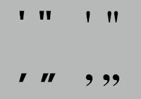
                                                                 Fig. 3.6 Prime and quote

A prime is not a quote. The prime is an abbreviation for inches and feet. Due to the limited number of keys on a typewriter, they were substituted. They were later known as ‘dumb quotes’. 


 Headline within Text

                                                                      Fig. 3.7 A heads

A head indicates a clear break between the topics within a section. 


                                                                      Fig. 3.8 B heads


The B head here is subordinate to A heads. B heads indicate a new supporting argument or example for the topic at hand. As such they should not interrupt the text as strongly as A heads do. Here the B heads are shown in small caps, italic, bold serif, and bold san serif.


                                                                  Fig. 3.9 C heads


C heads highlight specific facets of material within B head text. They don't interrupt the flow of reading.  C heads in this configuration are followed by at least an em space for visual separation.


Fig. 3.10 Hierarchy in a sequence of subheads

 Cross Alignment


                                                             Fig. 3.11 Cross alignment

Cross aligning headlines and captions with text type reinforces the architectural sense of the page—the structure—while articulating the complimentary vertical rhythms.


Describing Letterforms

Baseline: The imaginary line at the base of the letterforms

Median: The imaginary line defining the x-height of letterforms

X-height: The height in any typeface of the lowercase 'x'

Stroke: Any line that defines the basic letterform

Apex / Vertex: The point created by joining two diagonal stems

Arm: Short strokes off the stem of the letterform (horizontal: E, F, L; inclined upward: K, Y)

Ascender: The portion of the stem of a lowercase letterform that projects above the median

Barb: The half-serif finish on some curved stroke

Beak: The half-serif finish on the same horizontal arms

Bowl: The rounded form that describes a counter

Bracket: The transition between the serif and the stem

Cross Bar: The horizontal stroke in a letterform that joins two stems together

Cross Stroke: The horizontal stroke in a letterform that joins two stems together

Crotch: The interior space where two strokes meet

Descender: The portion of the stem of a lowercase letterform that projects below the baseline

Ear: The store extending out from the main stem or body of the letterform

Em/en: Originally referring to the width of an uppercase M, and em is now the distance equal to the size of the typeface; an en is half the size of an em

Finial: The rounded non-serif terminal to a stroke

Leg: Short stroke off the stem of the letterform (at the bottom: L; inclined downward: K, R)

Ligature: The character formed by the combination of two or more letterforms

Link: The stroke that connects the bowl and the loop of a lowercase G

Loop: The bowl created in the descender of the lowercase G (in some typefaces)

Serif: The right-angled or oblique foot at the end of the stroke

Shoulder: The curved stroke that is not part of a bowl

Spine: The curved stem of the S

Spur: The extension that articulated the junction of the curved and rectilinear stroke

Stem: The significant vertical or oblique stroke

Stress: The orientation of the letterform, indicated by the thin stroke in round forms

Swash: The flourish that extends the stroke of the letterform

Tail: The curved diagonal stroke at the finish of certain letterforms

Terminal: The self-contained finish of a store without a serif, it may be flat, flared, acute, grave, concave, convex or rounded as a ball or a teardrop (see finial)


WEEK  4 - LECTURE 4

2. The font

- Uppercase and lowercase

- Small capitals

- Uppercase and lowercase numerals

- Italic

- Punctuation and miscellaneous characters

- Ornaments


                                                        Fig.4.2 Uppercase & lowercase

Small Capitals: Uppercase letters drawn to x-height of the typeface


                                                             Fig. 4.3 Small caFpitals

Uppercase Numerals: Same height of as uppercase letters
Lowercase Numerals: Numerals set to x-height with ascenders and descenders

                                                
                                              Fig. 4.4  Uppercase and lowercase numerals

Italic: Refers back to fifteenth century Italian cursive handwriting

Punctuation, Miscellaneous Characters
It is important to ensure that all the characters are available in a typeface before choosing the
appropriate type


                                              Fig.4.5 Punctuation, miscellaneous characters

Ornaments: Used as flourishes in invitations or certificates
Usually provided as a font in a larger typeface family (Adobe Caslon Pro)


                                                                   Fig.4.6 Ornaments

3. Describing Typefaces

Roman: Uppercase forms are derived from inscriptions of Roman monuments. A slightly lighter stroke in roman is known as ‘Book’.

Italic: Named for 15th century Italian handwriting on which the forms are based. Oblique conversely is based on the roman form of typeface.

Boldface: Characterized by a thicker stroke than a roman form. It can also be called ‘semibold’, ‘medium’, ‘black’, ‘extra bold’, or super.

Light: A lighter stroke than the roman form. Even lighter strokes are called ‘thin’.

Condense: A version of the roman form, and extremely condense styles are often called ‘compressed’.  

Extended: Extended variation of a roman font.


                                                             Fig.4.7 Descrding typefaces

5. Comparing Typefaces 

Take note on the differences but not similarities

Beyond the gross differences in x-height, the forms display a wealth of variety, in line weight, relative stroke widths and in feeling. For any typographer these feelings connote specific use and expression.

The Rs display a range of attitudes, some whimsical, some stately, some mechanical, others calligraphic some harmonious and some awkward.


                                                             Fig.4.8 Comparing typefaces


INSTRUCTIONS


1. sketches

Mr Vinod advised us to choose and sketch out 5 words in case one of them get rejected. The 4 words I chose , water, crush,sick,fire.

1.WATER: 

I use the method is wave-shaped and drop-shaped and water reflections

2.CRUSH:

Letters are partially eliminated to make them look crushed or distorted or twist and crush

3.SICK:

Use words to express pictures or expressions by thinking of objects according to his meaning

4.FIRE:

Painting the vision of fire with words


Fig.4.9 sketchs (11.4.2023 - Week 2)


Fig.5.1 sketchs (11.4.2023 - Week 2)

2.Digital expressions


 Fig. 5.2Digital expressions (18.4.2023 - Week 3)


1.SICK:Use expressions and thermometers and needles to blend it into letters


Fig. 5.3 Digital expressions sick (1) (11.4.2023 - Week 2)

Fig. 5.4 Digital expressions sick -JPEG (11.4.2023 - Week 2)


2.WATER: Use letters to show the shape of a water drop


Fig. 5.5 Digital expressions water (2) (11.4.2023 - Week 2)

Fig. 5.6 Digital expressions water -JPE (11.4.2023 - Week 2)

3.FIRE: Change the shape of the letter to that of a fire burning


Fig. 5.7 Digital expressions fire (3) (11.4.2023 - Week 2)


Fig. 5.8 Digital expressions fire -JPEG (11.4.2023 - Week 2)


4.CRUSH: Letter C is distorted by other letters


   Fig. 5.9 Digital expressions crush (4) (11.4.2023 - Week 2)


                           Fig. 5.10 Digital expressions crush -JPEG (11.4.2023 - Week 2)


Fig.5.11 Final Type Expression - PDF (18.4.2023 - Week 3)

3. Animation 

After digitisation, we are required to choose 1 word out of the 4 and make it into a gif. After we are done with digitisation, Mr Vinod requested us to watch a tutorial video by him which he demonstrated on how to create an animation using Adobe Illustrator and Adobe Photoshop. 

I chose the word 'Crush' for the animation part. I followed the steps shown in the video and make the first attempt on animation of 'Crush


Fig.5.12 Final animated type expression (25.4.2023 - Week 4)


Fig.5.13 Final animation timeline (25.4.2023 - Week 4)

4.Text Formatting

Task 1 : Exercise 2 : Text Formatting
For exercise 2, we need to design a final layout that manages different areas of text formatting, including as kerningletter spacingalignmentleading and paragraph spacing. We are using Adobe InDesign to complete this exercise

1.Text formatting : Kerning and Tracking

   
                                            Fig 11.1 Exercise (25.4.2023 - Week 4)

Task 1: Exercise 2 - Text Formatting

Lecture 2:4 - Lecture 4:4A_Text formatting
Notes from lecture videos:
- Font size 8-12pt
- Line length 55-65 characters
- Leading (2, 2.5, 3pt) larger than the font size
- No widows and orphans
- Adjust the kerning and tracking so each paragraph looks smoother / not rough
- No exceed +3/-3 for tracking to reduce ragging 
- Force line space = shift + ent


   Fig 11.2. Cross alignment & baseline grid exercise (25.4.2023 - Week 4)


Fig.11.3 Layout 1 details (line length & cross alignment) (25.4.2023 - Week 4)

                         Fig.11.4 Final layout without grids - JPEG (2.5.2023 - Week 5)


Final Text Formatting


             Fig.11.5 Final layout without grids - PDF (2.5.2023 - Week 5)


Fig.11.6 Final layout with grids - PDF (2.5.2023 - Week 5)

Font :Bodoni Std
Type Size: 10pt   35 pt (headiine) 
Leading: 12 pt
Characters per-line: 51 ~ 61 
Alignment: Left align
Columns: 2
Margins: 3p0 

FEEDBACKS
Week 2
Questions:
1. Are the explorations sufficient?
2. Does the expression match the meaning of the word?
3. On a scale of 1–5, how strong is the idea?
4. How can the work be improved?
General Feedback:Submit sketches before digitalize. Specific Feedback: Mr Vinod asked me to sketch it out first and then make a digital version. 

Week 3 
Questions:
1. Do the expressions match the meaning of the words?
2. Are the expression well crafted (crafting/lines/shapes)?
    a. Do they sit well on the art-board
    b. Are the composition engaging? Impactful?
3. Are there unnecessary non-objective elements present?
4. How can the work be improved?
General Feedback: Avoid distortion and try to use more spaces of the box Specific Feedback: The graphics are a little too much, need to reduce som

Week 4:
General Feedback:When creating animation, it is best to increase a few seconds at the last frame. Specific Feedback: qualified

Week 5:
Question
1. Is kerning and tracking appropriately done?
2. Does the font size correspond to the line-length, leading & paragraph spacing
3. Is the alignment choice conducive to reading?
4. Has the ragging been controlled well?
5. Has cross-alignment been established using base-line grids?
6. Are widows and orphans present?
General Feedback: Choose an image that is relevant to the text and avoid choosing image with text; avoid widows and orphans; ensure constant paragraph spacing. Specific Feedback: The picture is not relevant, how many words in a line need to be changed, and the size of the words is not uniform
REFLECTIONS

Experience:
 I'm a new blogger, the first time I had the task of creating my own ePortfolio was difficult, but slowly it seems to be getting better, in these weeks I have completed two exercises on type expression and article formatting, and also watched the lecture videos posted by Mr. Vinod, at the beginning I fel


                                        Fig.11.6 Typography, Referenced (2012)

Comments

Popular posts from this blog

Immersive Visual Effects

Design Research Dissertation

Information Design - Exercise